Wednesday, 3 July 2013
Friday, 3 May 2013
Evaluation Question 4
Question: How did you use media technologies in the construction and research, planning and evaluation stages?
http://youtu.be/mk-WdfwDcBM
http://youtu.be/mk-WdfwDcBM
Wednesday, 1 May 2013
Evaluation Question 3
Question: What have you learned from your audience feedback?
http://youtu.be/Qx-lNK3GpmI
For this question I got a group of people to view my music video and asked them questions related to my video while I was recording them. I then made edited the footages making an audience feedback focus group video and posted it onto YouTube.
After that I made a Prezi Presentation of what I learned from the audience feedback.
Monday, 29 April 2013
Evaluation Question 2
Question: How effective is the combination of you main product and ancillary text?
http://youtu.be/Lp3hec5hP7Y
http://youtu.be/Lp3hec5hP7Y
Thursday, 25 April 2013
Evaluation Question 1
Question: In what way does your media product use, develop or challenge forms and conventions of real media products?
Tuesday, 12 March 2013
Final Advert And Digipak
This is my final digipak and advert, it took me a while to do but I'm quite impressed with the outcome considering the amount of time it took me to do it. Doing the cd took the most amount of time as there's loads of detailing on it and I had to photoshop the background of each logo and change the colour to a creamy yellow colour. It was hard to change the colour of some of the logo signs as it wasn't very clear while I was selecting the sections I wanted to paint. I wanted to keep the cd simple with the colours so i used black and cream as it ties in well with th images used.
Friday, 8 March 2013
Editing Process Of My Advert And Digipak
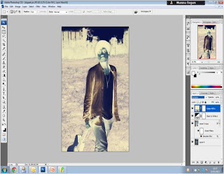
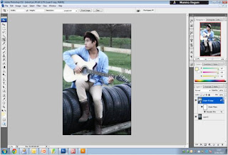
For my advert and digipak I used a YouTube video to create the effect I used for my images. The video helped guide me through each step as I wasn't quite sure how to do professional edit on photoshop. I first tried the edit on the digipak front cover image and thought it looked really good to I applied the effect on all the other images I used to keep it consistent and flow well. I took screen shots of the process of me editing the images, I didn't do a screen shot of every step as there was quite a bit of steps to take and I didn't really remember.
Friday, 22 February 2013
My Digipak CD and front cover mock
initially i didnt plan to have text all over the front cover of my digipak but for some reason Photoshop didn't let me colour in the font so I tried out to see how it will look with text all over it. I asked a few people what they thought and they actually liked it so I thought I might as well keep it like this as people like it.
Tuesday, 19 February 2013
Chosen Font
This is the chosen font I decided to use for my digipak and music advert. I got it from 1001 fonts just like other fonts we chose. Me and Julius didn't realise we had to do the digipak and advert separately, we shared ideas and come up with the name Vincent De La Reyes together so we both used the name as it wouldn't be fair if one of us used it and not the other. We changed the artist name to Vincent De La Reyes because we wasn't too sure if the name Julius had a flow to it or sounded professional and suitable for out music genre.
Saturday, 16 February 2013
Potential Font Designs
These were the fonts Julius and I were considering to use for our digipak that we got from 1001 fonts. We chose a different variety to see which one we prefered the most. I thought the first one was a bit too bold for a pop/rock albulm and the second looks more sutable for a classical album. Julius liked the third one quite a lot but I wasn't so sure as it looked a bit more fancy as I wanted to keep it simple. I did a bit more research as I wasn't too sure on the font styles we found.
Friday, 15 February 2013
Photographs For Digipak And Advert
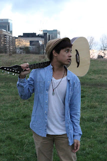
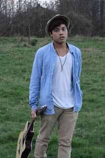
These are some of the images I was considering in using for my digipak and advert that I took of Julius and the location using a HD Nikon camera.
Thursday, 14 February 2013
Digipak Mock
This is a mock of mine and Julius’s digipak. We've taken loads of images for our digipak already but not sure which ones we are going to use but we do have faint ideas. However, we are going to take more images so we have more of a variety to choose from. For the front cover we had an idea of using an image of him looking away into the distance to suggest that he’s missing the actress from the video and it’s like he’s looking fro her. It also connotes that he’s a serious singer and he cares more about the singing and lyrics instead of how he looks. On the back we thought of having an image of Julius on the rule of third to make it look more interesting instead of just in the middle. It also allows a clear space for the song lists on the other side and obvious the barcode and texts and logos will go on the bottom right. On the inside of the digipak, instead of using another image of Julius we are going to use a close of the guitar and flowers on top as we used these props in our video and it emphasises the genre because of the use of guitar. Me and Julius had a different idea for the CD but we are going to test both ideas first before making a final choice. Julius thought of having an image behind the CD and when you take it out you will be able to see it and the CD to be plain. But I thought it will look quite cool if we have the image behind the CD as well as it being printed on the CD so the CD is like a puzzle and completes the image but the image will also be on the back too. The picture below is an example of something that I mean but I want the image inside the digipak to be the same as the CD not the front cover image.
Tuesday, 12 February 2013
Advert Analysis Of Rihanna
This is an advert for Rihannas Loud album that I will be analysing. As you can tell the colour scheme and the main image is very similar to her album cover, which also features on the advert. The colours and images all link together which makes it easier for the target market to spot or notice Rihannas Loud album. The use of red on the advert and digipak connotes sexy, dominant, brave, confident and also loud. The font and lettering is the same as on the album cover but a bit bolder because the target market needs to be able to notice the release date straight away. The angle of the shot used for the main image is a low angle which shows Rihanna is dominant which links in with the use of red. From the image it looks like she’s crossing her arms and looking into the distance, this contrast with the use of red and the low angle shot as she looks vulnerable and shy. She’s wearing a strapless dress which is also red to tie in the whole image together; it’s a bit low cut to show some of her cleavage to make her look sexier. She’s wearing a diamond bracelet around her arm and a diamond necklace to make her look less naked and makes the image more feminine. You can’t really see her face properly because her hair covers most of her face but it looks like she’s got her teethes against each other look quite sexy and the fact her hair is covering most of her face shows that she’s shy which is a contrast what she really is. The background of the main image looks like it’s been shot on a wheat farm which gives it that edge instead of just taking pictures on grass and the colour of the wheat goes well with the colour scheme. It’s got a warm, earthy tone to it. The image has been taken in the middle of nowhere like she’s lost and lonely which connects to her body language. One of her singles called Only Girl in the World which also connects to the image as she does look like the only girl in the world who has been isolated. From this image and the video for her actual song there is a massive contrast as she is shown way more confident and powerful in the video rather than here as well. On the advert an image of her album cover is also included so everyone can see how the cover looks so they won’t need to look around for it in the shop; they’ll already know how it looks. The main image has been shot on the rule of three rather than the middle as it’s so typical and boring to just shoot someone in the middle and there’s space for the image of the album on the right. From Rihanna dying hr hair red there was loads of females and males that started dying their hair red as well, this shows how influence Rihanna is as an artist and how her fans look up to her.
Monday, 11 February 2013
Analysis of Digipak – Rihanna Loud
This is Rihanna’s ‘Loud’ CD digipak, the image used of her face is a close-up looking down/closing her eyes which connotes she’s shy, vulnerable and like she’s hiding something. The font/lettering is really thin but still stands out as it’s in capital letters and contrasts from the image of Rihanna. It is simple lettering but still captures the eyes. The physical appearance of Rihanna is very sexy; this is shown with the use of red lipstick and her fiery red hair. Her red hair shows that she’s confident and brave as it’s such a vibrant colour. A high angle camera shot is used for her photo which emphasises on her vulneralablilty. You can’t see if she’s wearing any item of clothing as the image only shows her face and a little bit of her shoulder, but there is no sight of a sleeve on her shoulder. Her facial expression is neutral but she’s looking down/closing her eyes and you can see some of her teethes which connotes that she’s serious about her music. The dominant image within the front cover is of her face as it shows who the singer is. The title of the album is ‘LOUD’ which signifies Rihanna as an artist and reflects the attitude of her music; it also grabs your attention. The dominant colour of the album cover is red; this connotes sassy, flirty, energetic, confident and above all ‘Loud’. The CD is produced by Antonio "LA" Reid. This appeals to the audience because he has signed many other singers like Rihanna who will share the same fans such as Mariah Carey, Justin Bieber, Kanye West, Usher and Ne-Yo. He is also a judge on the US X Factor so more people will know him of all ages as X Factor is targeted at families. The record label is Def Jam Recordings which connotes Hip Hop, R’n’B and Urban music what Rihanna sings. The artist fits into the genre of R’n’B because this is signified by the conventions in her videos and the lyrics of her songs. The target audience for this CD cover is females possibly aged 16-23 but it’s Rihanna and everyone listens to her so there’s not really a specific target audience. The cover is appealing to the female audience more because of the prettiness and femininity but it does have an edge with the red lipstick to give it that sexiness. Young females will aspire to be like her and the male target audience will want to be with her.
Sunday, 10 February 2013
Final Music Video
This is mine and Julius final music video that we have been planning, researching and filming for all these months. We are really happy with the outcome and the time and effort has paid off. We used Final Cut to construct and edit the whole music video.
http://youtu.be/AtzOaqGLawk
Tuesday, 5 February 2013
First Draft Of Our Music Video
This is a first draft of mine and Julius music video. We still need to make a lot of changes and add more footage as there are black spaces. We kept the spaces blank because we need to add more performances and film the rest of the narrative. We do have a problem with the performance as we need to include more but its hard as most of the time goes towards the narrative and if we miss out some narrative or cut it short, it won’t really make sense. We posted it on YouTube to show the whole class so we can get feedback in how to improve and things we may need to change. One of the feedbacks we got was to remove the cancer letter at the end and leave it a mystery to the audience how she died and what the letter was about. It makes it more interesting if we let the audience come up with how she died and it will make people talk about the video and make it more popular if it’s a mystery.
Saturday, 2 February 2013
Friday 1st February 2013
We all went back to the Mudchute Train Station on Friday to re film as we had to rush the first time because we got told to lease, as we didn't have permission.
Sunday, 27 January 2013
Sunday 27th January 2013
Julius and I went to Millwall Park/Mudchute Farm again, where we did the performance filming to do two more shots of Julius singing as we thought we needed more close up and long shots of him. The long shot is for the end of the video to show that he's lonely without his girlfriend and we needed more close ups of him singing so the audience can engage more with him and feel his emotions. We also took more pictures for our digipak and advert so we have a range of photos to choose from. Later on we told Agata to come so we can film the train station scene and Julius running. I found it quite fun filming this as it was really funny but it was so awkward because people were looking out of their home windows and at the train station people inside the train were staring at us. We did have some trouble with the train station filming as we needed to wait over seven minutes for each train to go past so we needed to do it right the first time round instead of waiting for each train to go past. Another problem was when I was filming the train going past; you can see my reflection on the window so I had to bend down behind the Metro newspaper stand so I was invisible. It did kind of work as you couldn’t see me as much but if you focus and look closely you can slightly see me but there wasn’t any way to overcome this. People were also looking weirdly at me as I did look like a freaky stalker. Julius said he heard people saying ‘what is she doing’ and moving their heads to see what I was doing. The last problem we had was our biggest issue as there was a tanoid for us at the train station to stop filming and leave if we didn’t have permission and we had one more shot to film. We didn’t know we needed permission to film there so we didn’t know what to do but Julius and Agata went looking for a worker to explain what we were doing but they didn’t find anyone so we thought of just leaving as it was a little shot and it wasn’t that important.
Thursday, 24 January 2013
Self-Evaluation
This is a self-evaluation that I did on my planning and research. I have made bullet points of things that I think I have done well and things I need to improve on. I used the mark scheme to guide me through what I need to have done to achieve particular grades, I graded myself a C+ because it’s on level 3 however, I haven’t met many criteria’s on level 3.
SIMS Target Grade
|
B
|
Grade I award myself
|
R&P: Level 3/13 C+ Prod:
|
What I have done to achieve this grade
|
Research:
· I have researched the genre, audience and props well
|
Planning:
· Me and Julius have thought about the costume and props and hopefully it shows that we did consider the star image in our work
· I have kept an updated diary of all the filming we have done
| |
Production:
| |
How I can improve
|
Research:
· Check my spellings
· Include more images to support my ideas especially the essays
· Edit my Justin Bieber essay
· Do another advert analysis
· Do another digipak analysis
|
Planning
· Update location and filming schedule – we didn’t film in the cable carts at the end because of the timing and cost
· Write a little paragraph for each post
· Put all my work in order
· Write some of my work in more detail
· Include actor profile of Julius
· Add more images of location
· Possibly update my animatic storyboard including what my market research have said
· With the results of what my target market have said, make a post of what I have learnt and what I’m going to do next
· Upload mine and Julius practice shoot
· Upload mine and Julius first cut of our music video
| |
Production:
|
Wednesday, 23 January 2013
Re-Shooting
I and Julius decided we have to re shoot the scene in his house and when he runs after Agata as the footage that we took with the Sony HD camera came out blurry and pixilated. We used the Nikon SLR as the quality is much better and clearer. We did have an issue with the Nikon SLR as some of the shot we took came out blurry on it too and we didn’t know how to make it focus. You can see the difference between the different shots that the Nikon camera footage is clearer.
Organising Folders And Rushes
We had to upload our work onto iMovie then convert it to Final Cut to do the editing and adding the transitions. As there was loads of footage we had to organise our shots into different folders so it’s easier to find specific footage as it’s more organised. We created three ‘Bins’ a ‘used’ one, ‘maybe’ and ‘deleted’ so it makes the whole process a lot more faster and easier when it comes to editing but we did have to view all the footage first. After viewing all the footage and putting them in folders I named most of the clips to make it easier and simple to find the exact clip. Some of them were the same thing that’s why I had to name them with numbers after, for example ‘paint’ and ‘paint 1’.
Sunday, 20 January 2013
Sunday 20th January 2013
Julius had a last minute idea of doing filming on this day as both he and Agata were free. He didn’t really tell me to go because he knew I had to revise as I had an exam the next day and it wouldn’t have been a problem for him if I didn’t go as it was filming of just Agata. The day after Julius and Agata filmed he updated me on what happened, he said it went really well and didn’t take much time as it was a quick scene and there was a post box right next to Canary Wharf so they didn’t have to walk round looking for one. However the only problem they had was it was very windy on that day and Julius forgot to take the tripod so some of the filming was a bit shaky and not steady but you can’t really notice and.
Friday, 18 January 2013
Thursday 15th January 2013
Julius and I went to his house to re shoot the letter scene again because some of the shots we did was blurry with the Sony HD camera so this time we used the Nikon SLR. Also, we didn’t have time to do the running down the stair shots last time. It was so much clearer but one of the issues we had was that we didn’t know how to use the camera properly and some of the shots wasn’t focused clearly but it does look better than the footage with the Sony HD camera.
Tuesday, 8 January 2013
Monday 7th January 2013
Me, Julius and Agata went to Canary Wharf to film the date scene after School. I thought it went really well apart from at the beginning the footage was pixilated and you couldn’t seen Julius and Agatas face clearly but after the camera got better at focusing in the dark.
Subscribe to:
Comments (Atom)


